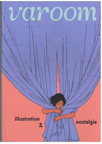
Varoom is a magazine that is created for illustrators. Its content was created by the association of illustrators. This issue is about nostalgia, sources from the magazine show that “‘Nostalgia’ is more than an adoption of the past – it’s a longing for times and places that no longer exist […] nostalgia as a weighty comfort blanket that we can wrap around ourselves for warmth and security” (Varoom, 2019). In my interpretation I think that this magazine is focusing on the well being on artist mental health hence when they mentioned about the comfort blanket, either that or about artist being in their comfort zone.
This is the front cover of Varoom issue 39 – Nostalgia.
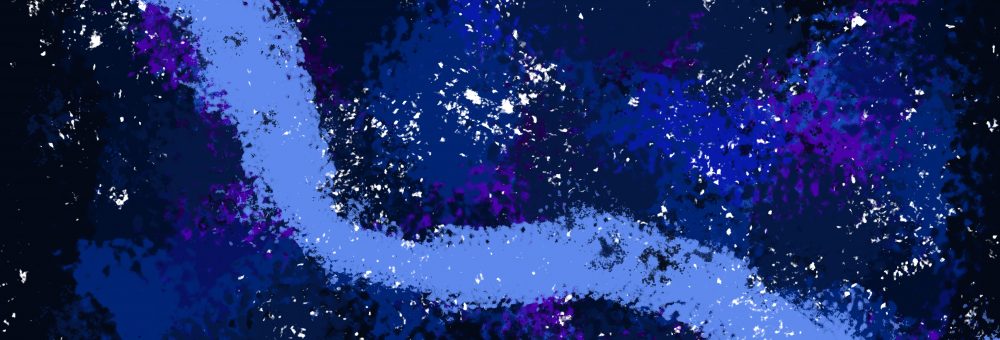
I have found an articles that I was drawn to, I chose this as I have linked it to the style I like and my project. The article is called distant memories. This is an article about an illustrator named Joey Yu who spent most of his childhood in England but spent his summer holidays in Hong Kong. He says in the magazine “I feel nostalgic for the films I saw […] weather report and adverts on TV” (Yu, 2019). From his illustrations you can see his idea of what nostalgia is and how it links with Hong Kong. I personally think you can see the link with the pinks and blues that he had used, I relate these to Hong Kong culture. My personal intake of Yu’s work is that I like how I can link his work with my own studies within children’s illustrations. Granted that these are morally older genre, however as an artist your able to take inspiration from the style of this work. Here is the article that I looked at and the style of work I was talking about.
As you see I am able to take the colour for inspiration. I can also take the line printing of which he used for the lining. This reminds me of an artist I researched before called Jim Butler (Butler, 2007) This is what his work looks like.
 I looked into this work when I created my mono printing for my environments. I will Insert an Image of my monoprint work here.
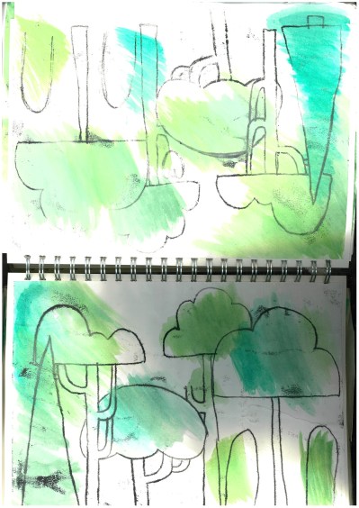
As you can see the resemblance to Butler’s work and Yu’s work are uncanny. This is a reason of why I wanted to read his article. He states that he get inspiration from Hong Kong. But the thing that drew me towards his article is that he states ” I use to have a hard drive filled with videos but it corrupted last year. That’s one reason I love drawing – It’s physical nature” (Yu, 2019) I found this so relatable as I love traditional methods such as using ink and pens and for him to say that drawing captures the enlightenment of what a camera would do. I couldn’t agree more. I found his words like a guidance for when I go into teaching. I could state that if you capture a moment from an eye to memory to paper. Its much more effective for when your creating digital content. It makes you remember more and have more emotion into art work if you follow this quote.
I also found as I was continuing to read his article that he love to use different materials of which he states “The materials I use always tend to be things that are quick in mark making. Coloured pencils, crayons, gouache. The images are layered up and sometimes, due to my recollections, incomplete.” (Yu, 2019) I found this to be interesting as I said earlier that I could take his work as inspiration for colour. I like how he uses different medias and His work isn’t always complete. As an illustrator you need a final outcome of an image however if drafts or as sketches they can become incomplete just like Yu’s work however I have to always state that my work is only incomplete when its sketching ideas. I find that the use of colour can be used to remember a happy memory or its associated with a mood you felt within that memory. I gathered this from one of his art work which I’ll place here.

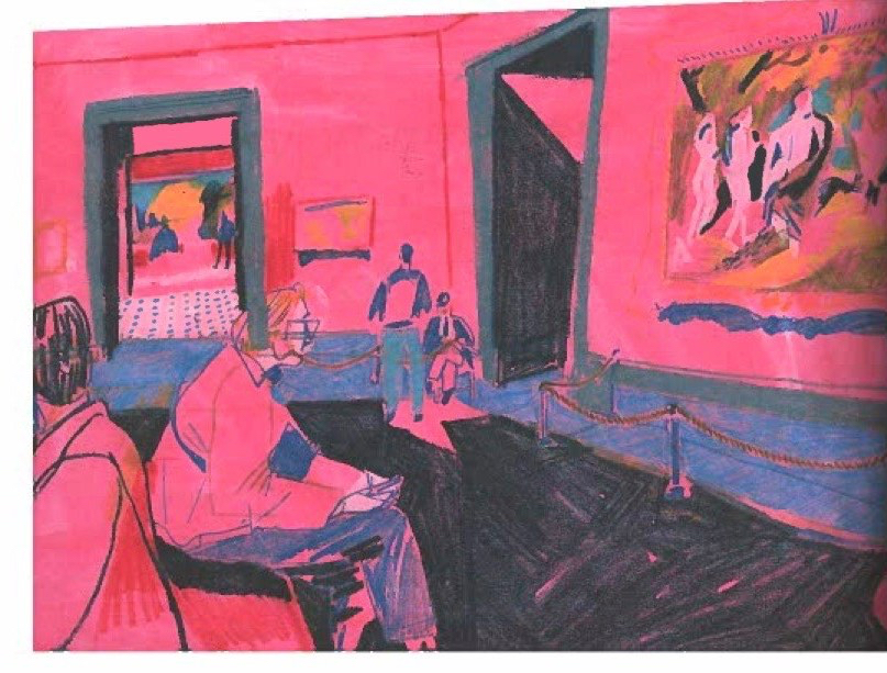
The red makes me think of passion and of which I can see Yu’s memory of being in London, This are work is called Looking Through Someone Else’s Eyes (Yu, 2019) he was at a gallery. I feel like he chose red because he felt at ease and felt passionate about the art he was surrounded in. Another feeling could be anger. Yu could have a memory of this being angry and didn’t seem to like the gallery or maybe he didn’t want to be there hence the reason maybe he’s added blue to show sadness. Or it could be as simple as he just likes the colour combination. The title gives you an understanding of what he was interpreting and that the angle shows us what someone would see if sat on the seat in the gallery. I just wondered if the colour choice was to clarify the “persons” feelings. If this was so I find its really intelligent as colour can make a whole difference to an art piece. I as an illustrator and who is creating a multi textual children’s book understands what colour can do for an illustration. I had to look into colour especially for a children’s book so that I could get my audience engaged. This I believe is what Yu’s done for his work.
A final outcome of this Magazine and the article is that I would highly recommend to read this and take a look at the article you can have a look and order from this link Varoom Issue (Varoom, 2019). You are able to find other artist and inspiration if you are an artist or illustrator. Or if you’re just interested in what I read then have a look and hope this blog has been interesting.
until the next blog
Rach 🙂
Bibliography
Butler, j. (2007). Jim Butler – Artist and Printmaker. [online] Jimbutlerartist.com. Available at: http://www.jimbutlerartist.com/drawings.htm [Accessed 6 Mar. 2019].
Varoom (2019). The AOI – What’s in the Latest Issue of Varoom. [online] The AOI. Available at: https://theaoi.com/varoom/varoom-blocks/latest-issue-2/ [Accessed 6 Mar. 2019].
Varoom (2019). Nostalgia. Varoom, (39).
Yu, J. (2019). Looking Through Someone Else’s Eyes. [Colour Pencil] London: London.
Yu, J. (2019). Distant Memories. Varoom, (39), p.4.
Yu, J. (2019). Distant Memories. Varoom, (39), p.6.
Yu, J. (2019). Distant Memories. Varoom, (39), p.15.
