Posted in Uncategorized

10 things you will see in an illustrators Bag

What would you see in my bag? Other than a heap of mess. This blog I will go through 10 things an artist would have in there bag and why they are important for us to use and keep close to us. 

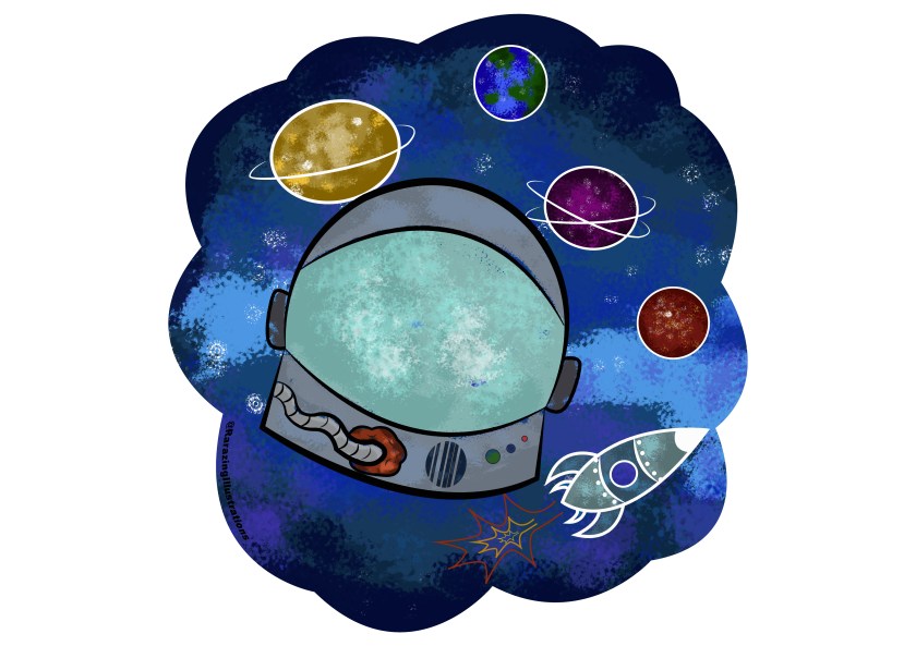
Now when you thunk of an illustrator you think cartoons, fun, hype and creativeness. You are not wrong but what do you think of when you have to place an illustrator into an everyday bag?. Do you think of summit like this? I created an illustration of what you may think is in an illustrators bag.

Bag.jpg

I am going to name those everyday essentials right now. 

In my bag I have:

First: Macbook Air

 I need this for my everyday life as an illustrator and a student. If I lost this I would loose everything I have worked for and more. I even use this to do my daily tasks like having a calendar and using my notes to have reminders and tasks to do. I use Photoshop and Illustrator on my MacBook and I answer emails and keep my university assignments on here. This essential is vital to an illustrator especially those who are digital artists or even a concept artist.

Second: Chargers

I have so many chargers. One for my phone, MacBook, other peoples phones, graphic tablet and even at one point my DS charger (I don’t take my DS everywhere anymore but I use to). As an illustrator who works digitally I need my chargers as you don’t know when you are in the moment of creating exciting content if your laptop or phone is going to die. I had a dilemma once where I was in the middle of creating a final piece for my animation and illustration course on the train and my laptop died on me. The devastation is real when you realise that the train you are on is that out of date that underneath does have a charging doc. Since then I always bring my chargers. Granted it makes my bag extremely heavy now but its so worth it. So chargers never forget them when your a digital illustrator. 

Third: Sketchbook

Even though I am a digital artist. I do jot down ideas first. I’m not an amateur. As an illustrator you need a sketchbook. Having ideas and trying to process digitally first is dead hard. Using paper is better as you can progress an idea traditional as a hard copy then once you have an idea in final your able to scan it onto your computer and then start digitally drawing. As an illustrator I believe having a sketchbook is like having a personal journal and a diary as you know that this drawing needs to be digitalise or painted or coloured which ever illustrator you are.

Fourth: Pens and pencils

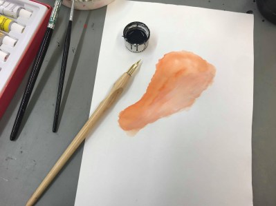
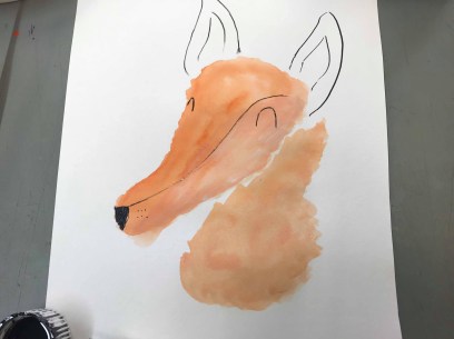
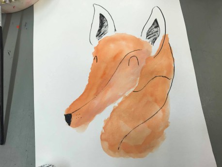
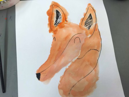
How can you jot ideas with out the tool to help with that. I always have pens, pencils, felt, liners and markers in my bag along side my sketchbook as like I was stating about owning a sketchbook your able to create so much content and idea planning with using drawing tools. I prefer using liners and a pencil for mine but sometime if I am really adventurous I will use a inkwell and quill. Special talent that is. I definitely think as an illustrator you need pens and pencils. I does make sense to have them as you wont be able to draw without them.

Five: Water Bottle (not filled with alcohol)

Even an illustrator needs to stay hydrated. As everyone knows scientifically water helps the brain to concentrate and make you more energised. I found while doing my university course drinking water helped with my concentration at looking at a computer all day. I found out that I was getting headaches a lot from staring at the screen all day and so I researched my symptoms and luckily it didn’t come up with me having some form of brain damage as we all know google likes to scare the B-geebies out of people. I found from a source that “The human brain is made of around 85% water. When you are not properly hydrated the effects can be felt in your brain as symptoms like headaches, poor concentration and reduced short-term memory.” (News, 2019) So as a responsible adult I started to drink water and since then I highly recommend having a water bottle in your bag.

Six: Phone

Cant live without a phone. But not like in a obsessed teenager way but that as an illustrator, if your like me. I record dates, times and schedules on my phone. I use my phone for everything. I have made some exciting phone calls on my phone like when I worked with Hadrian Border Brewery and organising case studies with many of schools within Hartlepool. I use my phone for emergencies and I use it for fun stuff too. I use IMotion on my phone and sometimes create stop motions in my spare time (thats when I get time). So I believe its very important to have your phone as an illustrator and as  person as you don’t know when your in a position to ring for help.

Seven: The latest issue of a art journal

In my bag I always have some form of an art journal. At the moment I have the latest version of Juxapoz (Magazine, 2019) as an illustrator I always recommend looking into using and reading art journals. I say this for a reason you get to know the trends of the month or even the year. You even get inspiration from using the journals as your able to look at what other artist have created. I recommend if your an artist and you get artist block, look at a journal and seek inspiration.

Eight: USB

You always need a USB when your a digital artist. I recommend as an illustrator you need backup after backup, after backup. You can never trust in your hardback draft to stay there until you’ve finished with it. I learned this over the years of being a student and becoming an illustrator. When I go into teaching I will be drilling this into the students who are want ing to pursue a career in art. Never forget to backup your backup.

Nine: Headphones

As an illustrator you need time to focus and get work done. Drowning out all the noice to relaxing music. I do this all the time. I only do this when I am on the train as I don’t like the sound of the brake and when I am trying to do work on the train its really hard to concentrate with all the screeching coming from the train. I recommend having headphones to just escape into your work and being able to get things done.

Ten: Diary

My final thing in my bag is a diary. Not a one where I write down my love crush but a diary to record dates. As I mentioned before how I use my phone and then I mentioned about a USB for back up well I back up my dates into my hardback diary. I find this to be more useful when going to appointments, interviews or meetings. It also help to remember the date more when its written down. As an illustrator I would get your self a diary. Not only do you have your date backed up but it also makes you look more organised than you may think you are. Little life hack there.

So thats what 10 thing you’d see in an illustrators bag, well mine shall I say. I hope you enjoyed this and have inspiration of what to carry in your bag, backpack or holder.

until the next blog

Rach 🙂

bibliography

Magazine, J. (2019). Juxtapoz Magazine – Home. [online] Juxtapoz.com. Available at: https://www.juxtapoz.com [Accessed 7 Mar. 2019].

News, N. (2019). Drinking water improves focus, reaction time. [online] Natural Health News. Available at: https://www.naturalhealthnews.uk/diet-2/2013/11/drinking-water-improves-focus-reaction-time/ [Accessed 7 Mar. 2019].


Posted in Uncategorized

Association of illustration: Oh, Monkey

Monkey competition.

Where I live in Hartlepool. The competition is for the association of illustration awards which is based on the Hartlepool monkey. I have found some research and some of my own knowledge of the legend of the Hartlepool Monkey. I’ll start with the story.

The story of the monkey stated back in the napoleonic wars of which the french were sailing the seas. The french on board had a monkey of which they got a bit merry with their rum and dressed the monkey up in the french soldier outfit. On that night a huge storm came over and the waves of the sea became angry. The ship got caught in the storm and they capsized and began to sink. The ruble of the ship started floating along shore of Hartlepool and in worry of an invasion the people of Hartlepool began to investigate. Soon to behold the lone survivor of the ship was the monkey dressed in the french clothing. As Hartlepool civilians had never seen a monkey before they were poorly judged and educated that they thought the monkey was a french spy. They decided the monkey had to go through a trial and courts to known of the monkeys punishment. So been told the punishment of the monkey was to be hung in the beach of the Headland. Since then Hartlepool have had the name as monkey hangers for many and many years.

I came across this story years ago when I started living in Hartlepool and I like how the story still lives on to this day. So obviously I wanted to be a part of this competition and created a project for the monkey competition. Here is a link to a story of the monkey hangers for more in-depth knowledge Monkey Hangers (Hangers, 2019). I created my Illustration based on the story its self and my own knowledge of the town I live in. I created the monkey and the Headland beach. Which included the stone arch to the entrance of the beach. Here is my intake of the monkey competition.

monkey comp

I used my comprehension and my skills to create this digitally painted final piece of the monkey. I over exaggerated the monkey over the water to give the symbolicalness of were the monkey came from. The beach is used to show which area of Hartlepool the monkey was hanged. I found this to be really important for educational purpose. As someone who wants to go into the teaching role. I find being educated in a historical topic even if its just a legend. I wanted to capture the funny side of a serious topic as people in Hartlepool do just laugh about it and its typical to show that not being educated in some aspects can lead to a serious outcome. But all in good cause, They were trying to protect their land and people who live in Hartlepool.

I want to provide the exact imagery that is hung up in King John Tavern (weather-spoons in Hartlepool) and how the legend live on in Hartlepool (Sculpts, 2013).  I only wanted to show this to give some proof that there was some proof of the legend itself. I just find this amazing that the story goes gone and has done for 200 years.

image.png

I just want to give a little awareness on what is the Association of Illustration (Illustrators, 2019). The association of illustration is an organisation which has been around since 1973 which provide guidance for illustrators in freelancing and advice with managements for your art. You are able to join their membership which covers illustrators, students and gets in touch with agencies. I know about this due to the college I go to and the degree course I’m on. I also know from the competitions of which I have been doing for 3 years now. This year I found about the North East Association of Illustration competition. Now bare in mind this organisation is based in London so when I knew there competition for this year was North East based I was stoked and for it being themed with my now new home town I was fully on board. If you are interested in looking for membership to the AOI or to find an agent I’ll leave a link to their website here Association Of Illustrators (Illustrators, 2019).

I hope this blog was interesting and found useful information until the next time

Rach 🙂

Bibliography

Hangers, M. (2019). The Hanging of the Hartlepool Monkey. [online] Historic UK. Available at: https://www.historic-uk.com/HistoryUK/HistoryofEngland/The-Hanging-of-the-Hartlepool-Monkey/ [Accessed 6 Mar. 2019].

Illustrators, A. (2019). The AOI – Home. [online] The AOI. Available at: https://theaoi.com [Accessed 6 Mar. 2019].

Sculpts, R. (2013). More tales of Monkey Hangers | planetFigure | Miniatures. [online] Planetfigure.com. Available at: https://www.planetfigure.com/threads/more-tales-of-monkey-hangers.59185/ [Accessed 6 Mar. 2019].


Posted in Uncategorized

My Manifesto. Where I all began…

How did myself, as an illustrator. come along.

My story started when Rara was a little nugget just starting secondary school. I seemed to of made a good impression with my art teacher. I know this because during a lesson he was wondering around looking at what we were doing and he noticed a drawing that I did of a hand emerging into a dinosaur. He asked me “Rachel, what do you wanna do when you grow up?” by this point I just looked completely gormless and said “Dunno sir”. My teacher took it to himself to take me out of class and show me this board. A massive board filled with animators, illustrators and cartoonist. He then pursued to say “I bet you could do that”. From that second I think I was just in aw with the fact I had (And did for many years) had a number one fan of my art work.

By this point I was dedicated and continued to enjoy and learn art with its many forms. I chose my GCSEs to get me to college/sixth form. These consisted with fine art, history, construction (I got taught a little about architecture) and obviously maths and english. I made sure I got good grades and stuck into education. I enjoyed learning and my art class a lot when I was in school. So much so that I won an award at school for gaining an A  in fine art. (just a note sorry for the bad image of my certificate this was taken back in 2014 and the certificate itself is somewhere at my grandparents) 53316679_1559922067471985_1481080576801767424_n

That was a proud moment for me. And it should of been because due to my hard work I managed to get into Durham Sixth form centre for film and tv production, graphics and fine art. During that time period of 2 years I loved my graphics class and film and tv media, I found that I was good at photography and digital art. I loved filming and leaning about how to use a camera in the film production, along with storyboarding. I got taught tricks and tips of which I dedicated research for going into animation and illustration. However fine art in college was a nightmare. I didn’t seem to see eye to eye with my art teacher and trying to pursue my love of art within fine art was a task and a half however I did take on skills and how to use materials in which I used to strengthen my methods with in my artwork.

When those 2 years where over and got my grades I was over the moon when I found out that I got a diploma in film and tv production and a good grade in graphics. I managed to gain good feedback from off my teachers who taught me within those 2 years and I gained so much confidence in being an artist.

Thats when I started the course of animation and Illustration. I made it. Don’t get me wrong it was hard at first and being taught how to draw digitally and how to use illustrator and Photoshop (I already knew how to use Photoshop in graphics at sixth form) But I gained so much and I mean so much skills and confidence. I did work with a brewery called Hadrian Border Brewery in Newcastle. This was when I created the folklore series with there pump clips. I managed to gain experience from doing competitions and advertising my work. I’m still currently studying on the cause for my BA Honours in illustration and I’ve enjoyed my time and experiences.

I did realise last year that I enjoyed my time on the course of animation and illustration. I also enjoyed my education, also being in education, helping people and gaining trust within people and my tutors. Which gave me new look on life and my future. I realised I want to be like those who inspired me and had confidence and faith in my artwork. I want to become an art teacher.

I make sure that my determent self always put my all into what I do. I stay true to myself. Be only the best of what I make it and from there I will become a great teacher like the teachers who taught me.

Now all that is left is to complete this cause with a good grade and apply for my PGCE’s. Heres to the future that I work hard my extreme hardest for everyday.

Until the next blog

Rara

🙂


Posted in Uncategorized

Varoom: My intake and review

Varoom is a magazine that is created for illustrators. Its content was created by the association of illustrators. This issue is about nostalgia, sources from the magazine show that “‘Nostalgia’ is more than an adoption of the past – it’s a longing for times and places that no longer exist […] nostalgia as a weighty comfort blanket that we can wrap around ourselves for warmth and security” (Varoom, 2019). In my interpretation I think that this magazine is focusing on the well being on artist mental health hence when they mentioned about the comfort blanket, either that or about artist being in their comfort zone.

This is the front cover of Varoom issue 39 – Nostalgia.

varoom.jpg

I have found an articles that I was drawn to, I chose this as I have linked it to the style I like and my project. The article is called distant memories. This is an article about an illustrator named Joey Yu who spent most of his childhood in England but spent his summer holidays in Hong Kong. He says in the magazine “I feel nostalgic for the films I saw […] weather report and adverts on TV” (Yu, 2019). From his illustrations you can see his idea of what nostalgia is and how it links with Hong Kong. I personally think you can see the link with the pinks and blues that he had used, I relate these to Hong Kong culture. My personal intake of Yu’s work is that I like how I can link his work with my own studies within children’s illustrations. Granted that these are morally older genre, however as an artist your able to take inspiration from the style of this work. Here is the article that I looked at and the style of work I was talking about.

doc000-1.jpg

As you see I am able to take the colour for inspiration. I can also take the line printing of which he used for the lining. This reminds me of an artist I researched before called Jim Butler (Butler, 2007) This is what his work looks like. 

image.png
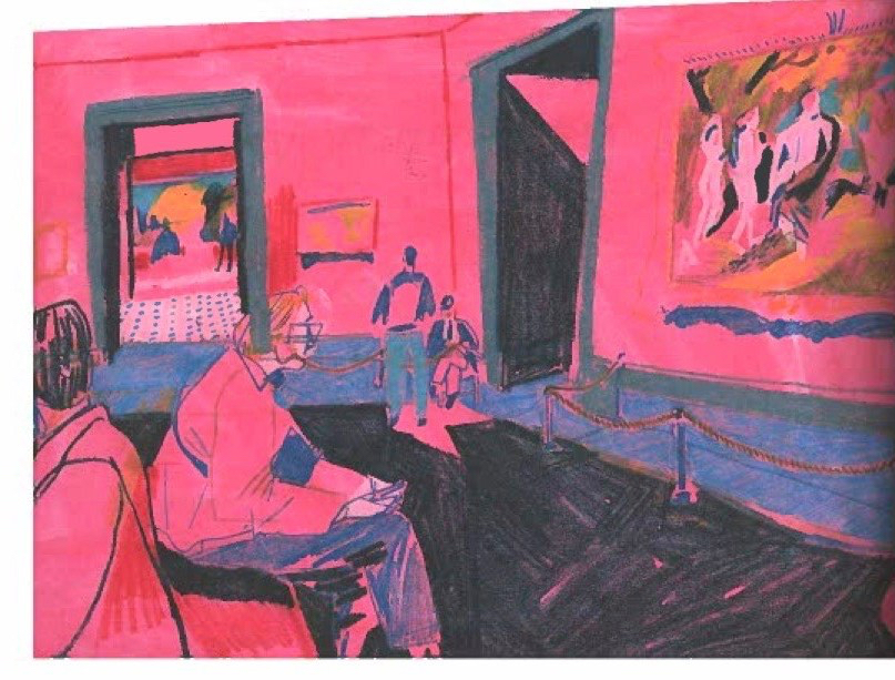
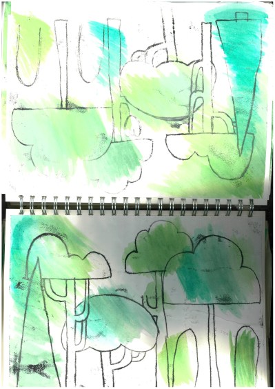
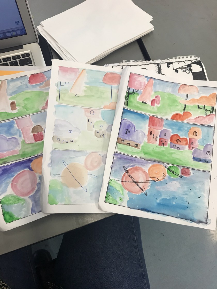
I looked into this work when I created my mono printing for my environments. I will Insert an Image of my monoprint work here.

Xerox Scan_22032019131445.jpg

As you can see the resemblance to Butler’s work and Yu’s work are uncanny. This is a reason of why I wanted to read his article. He states that he get inspiration from Hong Kong. But the thing that drew me towards his article is that he states ” I use to have a hard drive filled with videos but it corrupted last year. That’s one reason I love drawing – It’s physical nature” (Yu, 2019) I found this so relatable as I love traditional methods such as using ink and pens and for him to say that drawing captures the enlightenment of what a camera would do. I couldn’t agree more. I found his words like a guidance for when I go into teaching. I could state that if you capture a moment from an eye to memory to paper. Its much more effective for when your creating digital content. It makes you remember more and have more emotion into art work if you follow this quote.

I also found as I was continuing to read his article that he love to use different materials of which he states “The materials I use always tend to be things that are quick in mark making. Coloured pencils, crayons, gouache. The images are layered up and sometimes, due to my recollections, incomplete.” (Yu, 2019) I found this to be interesting as I said earlier that I could take his work as inspiration for colour. I like how he uses different medias and His work isn’t always complete. As an illustrator you need a final outcome of an image however if drafts or as sketches they can become incomplete just like Yu’s work however I have to always state that my work is only incomplete when its sketching ideas. I find that the use of colour can be used to remember a happy memory or its associated with a mood you felt within that memory. I gathered this from one of his art work which I’ll place here.

doc000-1-e1557751438558.jpg

The red makes me think of passion and of which I can see Yu’s memory of being in London, This are work is called Looking Through Someone Else’s Eyes (Yu, 2019) he was at a gallery. I feel like he chose red because he felt at ease and felt passionate about the art he was surrounded in. Another feeling could be anger. Yu could have a memory of this being angry and didn’t seem to like the gallery or maybe he didn’t want to be there hence the reason maybe he’s added blue to show sadness. Or it could be as simple as he just likes the colour combination. The title gives you an understanding of what he was interpreting and that the angle shows us what someone would see if sat on the seat in the gallery. I just wondered if the colour choice was to clarify the “persons” feelings. If this was so I find its really intelligent as colour can make a whole difference to an art piece. I as an illustrator and who is creating a multi textual children’s book understands what colour can do for an illustration. I had to look into colour especially for a children’s book so that I could get my audience engaged. This I believe is what Yu’s done for his work.

A final outcome of this Magazine and the article is that I would highly recommend to read this and take a look at the article you can have a look and order from this link Varoom Issue (Varoom, 2019). You are able to find other artist and inspiration if you are an artist or illustrator. Or if you’re just interested in what I read then have a look and hope this blog has been interesting.

until the next blog

Rach 🙂

Bibliography

Butler, j. (2007). Jim Butler – Artist and Printmaker. [online] Jimbutlerartist.com. Available at: http://www.jimbutlerartist.com/drawings.htm [Accessed 6 Mar. 2019].

Varoom (2019). The AOI – What’s in the Latest Issue of Varoom. [online] The AOI. Available at: https://theaoi.com/varoom/varoom-blocks/latest-issue-2/ [Accessed 6 Mar. 2019].

Varoom (2019). Nostalgia. Varoom, (39).

Yu, J. (2019). Looking Through Someone Else’s Eyes. [Colour Pencil] London: London.

Yu, J. (2019). Distant Memories. Varoom, (39), p.4.

Yu, J. (2019). Distant Memories. Varoom, (39), p.6.

Yu, J. (2019). Distant Memories. Varoom, (39), p.15.


Posted in Uncategorized

Interview Style

In this blog I will be running through some interview style questions which I am describing about me and my work then following questions about my future career into teaching and how I’d answer the questions to describe my passion for the job. 

Where did the name “Rarazing Illustrations” came around?

The name “Rara” came first, I got that nick name from my nephew back when he was a year old and learning to talk. He came out with Rara for Rachel and its been my name ever since. 8 years down the line and my nephew still calls me Auntie Rara. I do tell people my name is Rara but I do tend to go by Rach. I have never liked my Christian name Rachel I always think its an old fashioned name and I may have been raised with older values with some different outlooks on life. My style and personality is far from my name. I am quirky, I have a weird sense of humour and speak far too much of the honest truths. Thats why I always go by either Rach or Rara. However since being in university some people have called me Ra and I like that too makes me feel like a grown up Rara. The “Zing” in “Rarazing” is Rara and amazing collided into one. My humour found these too word mixed together amusing as I thought it sounded like an erotic feature in an Ann Summers Store (Summers, 2019). But that’s just my personality and I figured I’d be noticed more actually with children illustrators as it does sound like something from the Disney Channel (Channel, 2019). So that was the birth of Rarazing and the illustrations is kinda obvious because I create Illustrations and enjoy drawing content. Thats where my artist name came from.   

What Inspired this art piece? 

Mirror talk.jpg

This is the project I did for my animation and illustration course. I created two imagery along with a script about a woman who was suffering with traumatic anxiety. I wanted to create a booklet of which included my illustrations and my photography skills. The story was about this woman who has to spend all her days with this character hovering around named Incubus. The term incubus (Definition, 2019) is an awful description. But so is having a traumatic experience. The term Incubus links with the experience the girl had went through and if you are interested in the term I’ll leave a link down below. . In the story its describes how she’s not coping and is having enough. So much so she fights her battle with the entity and traps Incubus in a cage and now she controls him.  The moral of the story is that if you are a sufferer of anxiety and depression, that you are not alone. I was trying to show that you can gain help and that talking to someone and fighting your demons can help with bad memories and feelings to calm down. I did this so that I could help the mental health society and tried to publicise mental health awareness as it was a huge deal back in 2018. 

How are you going to use your skills in the near future after your course has ended? 

I am going to be continuing to use my Photoshop and Illustrator skills. I am going to continue to improve these skills by enhancing them further. I am willing to take on advice and criticism to become more experienced. I can do this by continuing in a role in education. 

What do you want to do after University? 

After my university course I am going to become a digital art teacher for level 1 and 2. I have focused my final year to become a teacher. I have been able to do this by basing my work on a children’s book, attending schools and applying for my PGCE interviews. I hope to gain this career as I want to help those who want to pursue a career in digital art. 

What drew you towards teaching?

The day I wanted to become a teacher was when I felt full filled with my work and had guidance from my tutor in university. My tutor inspired me to become a teacher and the further I researched into teaching the more I was getting intrigued. I chose level 1 and 2 because as much as they are freshly out of secondary school I want to provide guidance for students who are wanting to pursue a career in art while continuing with their GCSE maths and english. I want to be that teacher who says you can and you will. I believe that anyone has the right to become what they want to be no matter what background or who they are. 

Why do you want to teach level 1 and 2?

I want to show to student who are in level 1 and 2 that they are able to become anything they choose within art. I still want to be a teacher who will help students who might not want to pursue a career in art but in a different subject. I want to make sure every student is comfortable and has the correct guidance. I hope that this will gain confidence and to be understood. 

What makes you think your suitable for the job?

I believe over the three years of my university course I have gained knowledge and understanding of those who have a passion for art. I have developed skills and attributes which I will benefit my aspirations to become a teacher. I am currently volunteering as a mentor for children, young adult and adults with specific learning difficulties every week. At this moment in time I feel that I am ready to pursue a career in teaching as I have matured into a confidant and professional young adult and am eager to share my skills, knowledge and experiences within a teaching role.

What does becoming a teacher make you feel? 

To become a teacher is like I have a new set of eyes. I see things in such a different way, I now have the mind set of how can I help this person or what should I do to improve on this. I feel more accepting and have more patience. I find my personality to of matured and the way I present myself. I think becoming a teacher is going to be rewarding as I already fell rewarded when I help my peers and members at my voluntary job at the Artrium.  

Until the next time

Rach 🙂

link: Incubus definition

Bibliography

Channel, D. (2019). Watch Disney Channel Shows – Full Episodes & Videos | DisneyNOW. [online] Disneynow.go.com. Available at: https://disneynow.go.com/all-shows/disney-channel [Accessed 4 Mar. 2019].

Definition, I. (2019). the definition of incubus. [online] http://www.dictionary.com. Available at: https://www.dictionary.com/browse/incubus [Accessed 4 Mar. 2019].

Summers, A. (2019). Ann Summers Official Online Store | The Sexual Innovation Experts. [online] Annsummers.com. Available at: https://www.annsummers.com [Accessed 4 Mar. 2019].

Posted in Uncategorized

Tutorial: How to use watercolour within illustration.

I’ve always been fascinated with watercolours and using watercolours within my work through secondary school, sixth form and now university.

I’ve spoke to many of people and they have said they cant master how to control watercolours or be able to blend and draw with them. So I figured i’ll make a How to use watercolour within Illustration.

First of all, if your starting from the beginning I’d suggest using water pencils first. Your able to get some water pencils from Hobby craft (Craft, 2019), or if your not from the UK your local craft stores. I only suggest this method first so that your able to get grips with using a paint and water and what best way for that id to have the paint in a pencil form. I’d suggest looking at this YouTube video of someone using watercolours called How to paint with watercolor pencils- painting ideas for beginners by Makoccino (Makoccino, 2018). After you have gotten the grips of using water pencils I then would suggest using water paints but in tablet form. This is a formula that is like chalk but it asks like water paint. You don’t get much pigment from the tablets but they are good to help get in the swing of using a pallet and water. You are able to pick up the watercolour pallet from the works (Supplies and Paint, 2019).  Once you have a hang of the water pencils and the water tablets then you are able to start painting with actual water paints. The ones I use are from the works (Paint and Set, 2019). They tend to work really well and I haven’t found a better and cheaper alternative to these. I will say that if you spend a little more money the quality of your water paintings will improve and seem more better condition.

I am going to provide a little tutorial of which I can provide how to do a simple character using water colour and ink. I do this method all the time and I use it for my characters for my last project back in 2017-18. I can provide an example here.

scan-1.jpeg

As you can see its really simple and I can show you and with some simple steps on how you can do it yourself.

Step one:

First of all make sure you have all your supplies with you. This is including paper. I do recommend water paper however any paper can work just as well. You also need ink and water paint. As you can see I am using the water paint from the works of which I will provide imagery through out this tutorial.

Step two:

Create a shape of what you want to create. I am going to do a fox as thats what I am basing my multi textual children’s book on. As you see here I create a water mark with the waterpaint. I used the colour orange and I dipped my paint brush into the water only slight then placed a small amount of paint with the water on the brush.

60052529_299554307632243_4898573242341523456_n.jpg

Step three:

To give a bit of dimension to the water mark add white water paint to the area that is meant to be the cheek. You can do this by using water and a little amount of white paint, place on top of the orange and blend in, Using water keep blending until it looks like this but don’t use too much water as you’ll drench the paper.

60038084_362627977937923_5228136214791454720_n

Step four:

Its now time to add the ink to your water mark. Grab the ink and place into a small container and using a quill or a small paint brush. Your able to now start adding details.

60083398_425311171633144_1614421500113190912_n.jpg

Step five:

As you see here I added the ears to my water mark. It’ll start taking shape the more you add detail to the character you want.

60341044_660482041054719_940327838999904256_n.jpg

Step six:

You can then start adding more detailing. Your able to create a body or tail. Your able to decide as you start adding more features with the ink.

60635620_1261963950644317_435827051832803328_n.jpg

Step seven:

Start adding the face. Or anything you want with the features. I added the eyes, nose and freckles.

60200838_417170505772182_2163632501694660608_n.jpg

Step eight:

Your now able to decide if its the tail or the body with the other water mark I am going to create a tail. So I extended the tail up to the ear and by using the ink I added the tail detailing. As seen here

60191030_286551338726639_5364771962134462464_n.jpg

Step nine:

I wanted to add some water marks on the ears and finishing up some touches.

60348731_303207033930914_1536665695654248448_n.jpg

Step ten:

You now have a water painting with ink of a fox or whatever character you decided to create. I hope you enjoyed the tutorial.

60266665_406318473543676_3830456171936874496_n

Until the next blog

Rach 😉

bibliography

Craft, H. (2019). Watercolour Pencils | Drawing Tools | Hobbycraft. [online] Hobbycraft.co.uk. Available at: https://www.hobbycraft.co.uk/art-supplies/drawing/watercolour-pencils [Accessed 14 Jan. 2019].

Craft, H. (2019). Watercolour Pencils | Drawing Tools | Hobbycraft. [online] Hobbycraft.co.uk. Available at: https://www.hobbycraft.co.uk/art-supplies/drawing/watercolour-pencils [Accessed 14 Jan. 2019].

Paint, W. and Set, R. (2019). Reeves 6 Tube Watercolour Starter Set | Watercolour Paint at The Works. [online] Theworks.co.uk. Available at: https://www.theworks.co.uk/p/watercolour-paint/reeves-6-tube-watercolour-starter-set/780804850970 [Accessed 10 Mar. 2019].

Supplies, A. and Paint, W. (2019). 11 Watercolour Tablets with Brush | Watercolour Paint at The Works. [online] Theworks.co.uk. Available at: https://www.theworks.co.uk/p/watercolour-paint/11-watercolour-tablets-with-brush/5052089218338 [Accessed 4 Jan. 2019].


Posted in Uncategorized

Weekly review: Semester 2 started

Its the week into semester 2 and the tension is there after hand in and waiting on getting a grade back and waiting on feedback. However in this blog I am running over the week of semester 2. To start we had a lecture on our last modules for the 5 months left of our course. We ran over the tasks that we need to do. We got told we needed to start having a final look on what we are doing for the final show and our final project. We also got told that we needed to plan for our portfolios and portfolio books. I had a talk with my tutor about what I should be doing for my last modules. We came up with the idea to start looking into the storyboards and the script to the multi textual children’s book. I managed to keep a track of what I needed to do and I started this semester off in the library.

My tutor suggested me to look at books which focus on storyboarding. A book he suggested was Don Bluth’s art of storyboarding (Bluth, 2005). I was ecstatic to find out about this book as I am a fan of Don Bluth’s work he was Disney’s illustrator and the creator of one of my favourite Disney film called A Troll In Central Park (A Troll In Central Park, 1994). I managed to find this book and a few others and had a look through them and managed to figure out some content for my own script and storyboards. I will place some imagery of some experiments I have done for my storyboarding. E32E56D6-05F2-4E2F-8CB1-BD1606FA0795.jpg

This is one idea I have created by using water paints Of which I created a blog about on using water paints and Illustrations of which you can read here Tutorial: How to use watercolour within illustration. I used this method for my story boarding to help with free handing ideas and having a loose train of thought. Using water colours can be difficult but using it to loosely jotting ideas can be fun and creative way of thinking. As you see here I used this to help with my story layout and I found that using water paints easier that using pencil and it looks more inviting. I have incorporated with ink to add dimension and texture as I wanted to show my intentions for my multi textual children’s book. 

I have stated in my sketchbook the reasoning of why I have chose to do these methods and how I have based it towards my multi textual children’s book. I have provided my sketchbook with experimental and development work towards my storyboards. I have used more experimental work this week and managed to record these experiments and continue to find a final storyboard method of which I was comfortable with.

My goal for this semester is to start planning and organising my script, I can place here for you to read Where’s Mr Fox? script. I have placed my script and my planning for my script in my sketchbook. I have created a script at the beginning of my semester 2 (I did this on the train home) I wanted to create the script first to help with my structure for the storyboards. I already created 3 scene for my multi textual children’s book with an idea of what I wanted to create but before I could create further content for the multi textual children’s book I have to find out if I need more pages or extra characters. I figured I would only know this if I created a script. I have placed pages and experimental work with water paint for extra characters and individual environments. I had an idea to create a storyboard by scanning and placing my watercolour illustrations in Photoshop and arranging them. I didn’t like how the illustrations turned out and I didn’t want to attempt to create a storyboard with this but I have documented my work in my sketchbook.

Over this period I have found a method of how I want to create my storyboards and have been recorded into my sketchbook. I have started my commercial work and my collaboration. I have made sure that I will be able to include these and record any sketches and planning for my work.

For my collaboration work I had done this with a level 6 media student and she wanted me to create child drawn-like turtles. In this blog I am going to show you some examples of how I had created a little turtle and from this example I managed to create 16 or 18 of them. I will continue to show you what I did and how I created a little turtle. To start I had a meeting with the student. We sat down and they told me that they had did some case studies and got children to draw a character for the mini stop-motion capture that they are making. I was shown the imagery that was drawn by the children and they created a turtle. The turtle was actually the classroom pet called Max. From this I was sent over by via email the drawings and was asked to “mock style” the turtles and tidy them up. I managed to understand what they were saying and I created this style of turtle. I will show here.

image.png

This here is an example of the children drawings of which (Topal, 2018) had provided me these. As you see the child has drawn a turtle and my job is to keep this style but make it look more neat and tidy. I had achieved this by using the imagery as a guide and traced neatly in Illustrator. I then coloured and corrected in Photoshop and created something like this.

Screen Shot 2019-05-24 at 14.00.00.png

As you see I kept the child like style and as they wished I managed to create a bundle of turtles. I have recorded this process in my sketchbook and In another blog Evaluation: Life update into the future for me You are able to read here about my progress into my teaching alongside growing up. Example of this is that this year and in that blog I stated about buying a house. Planning my future to become a teacher and working as an artist mentor at the Artrium. I hope you have enjoyed this blog and hope you found this useful.

until the next time

Rach 🙂


Bibliography

A Troll In Central Park. (1994). [film] Directed by D. Bluth. Hollywood: Walt Disney.

Bluth, D. (2005). Don Bluth’s the art of animation drawing. Milwaukie, Or.: DH.

Topal, D. (2018). Turtles. [coloured pencil] Newcastle: Newcastle.

Posted in Uncategorized

Reading week #3: Valerian

Todays reading week I am looking into one of my favourite graphic novels and that is the series of Valerian and Laureline: The Time Opener by Pierre Christin (Christin, Mézières and Tranlé, 2010).

I’m looking at this novel because for starters I grew up reading this comic and the other series/issues and two I’ve always love the panelling of the storyboards and layout. Jean-Claude Mezieres is the artists of this series of valerian and I’ve found his approach to be unique yet simple and with a flow of the other style comics for Valerian.

From the pipeline comics web page it quotes ” This volume is the conclusion to Valerian & Laureline’s saga.  It brings back characters and refers to events from just about every book from the series” (Comics, 2019). I think this is purely from the illustrations by Mezieres. the artist has captured each character to their correct status in the comic and from my experience its was from the illustrations of the characters and the storyline that drew me into reading them as a child.

The one thing I liked about this comic is the front cover. As you see here.

52779845_250872655854291_8794891801459687424_n

When I look at this front cover I think. This is one classic comic book front cover. The colours and style of illustration remind me of a comic artist named Fiona Staples (Staples, 2019). She was the creator of Saga series. Her work was rated in the top 25 comic book artists by SYFY (Estrella, 2019). From this source I have other comic book artist like Becky Cloonan (Cloonan, 2019) the creator of The True Lives of the Fabulous Killjoys. As I looked at these artists I found that I have a fond likeness to “typical” comic book styles like Valerian.

The thing that I like about this comic style is the bold colours and watercolour style of the planets. As we all know now I am a fan of watercolours and illustrations.  This is a reason of why I like valerian comics. I am Preparing myself to create a how to use watercolours within illustration so stay tuned for that.

I also want to give a little recognition for the Valerian film which came out in 2017. Let have a little recap on what the film is about. With using one of my “favourite” film critic on the interweb and that is Rotten Tomatoes (if you didn’t guess already I was being sarcastic). No, the real reason of why I use this source is because who doesn’t like a little convention. Without further or do lets get into this…

IMG_0824.GIF

Right so, before I get into the juice of my opinion against Rotten Tomatoes. Here is a recap of what Valerian and the city of a thousand planets is all about. Valerian is a special operatives who has a side kick called Laureline. Together they act like space cops and make sure everything is in place in space (weyhey). The thousand planets was formed before their time but knew of its existence and they came to get to the thousand planets due to a job of which they come across a cute alien doglike pet, Or I think its meant to be a guinea pig. Either way its cute. So on so forth they get up to some crazy tasks to find out what happened to this planet called Mül which was destroyed about 30 odd years ago. Now that we have a brief idea of the movie lets go and see my opinion to Rotten Tomatoes.

Rotten tomatoes state that “DeHaan and Delevingne can do better – and so can the rest of us” (Bradshaw, 2017). Have to say one you watch a film for the story and the cinema feature not for the actors per-say however I do agree they could of done better but I don’t think this is relevant right now as I as a film lover and who studied film and tv production I think of editing skills and the director. Speaking of which a critic on Rotten Tomatoes had a great status about this and said “The fantasy worlds and creatures rendered in astoundingly beautiful visual effects are worth the ticket price alone, dazzling in 3D and an immersive, imaginative delight” (,) I have to agree the visual aspect of the film was a delight to watch and as an illustrator and who also studied animation for 2 years. I have to admire the SFX and the CGI of the planets, creatures and film making itself. I am very bias towards this movie as I did really love it but I have kept a mature head on and shown Rotten Tomatoes critics. Example like this one “I can picture this film becoming a bit of a cult classic but don’t wait for that” (Wagner, 2017). Granted this stung a lot as a fan for the director and the film itself. But I do see what they mean here. However I think if you look at the magical aspects of this film and the entertainment value then this film is spot on. It has fantastic graphics and animation. The storyline was like I was following a comic. One, its not meant to be completely making sense they were following a comic style script. what do you expect. Two, The story line was based on Valerian finally committing to Laureline and trust me I have been waiting for this to happen for so, so long. People who have criticised this keep referring to Fifth Element. Sorry to state this but. It’s not Fifth Element. Its Valerian. The two are completely different. Granted some of the creatures are the same but its basing on the universe, space the big galactic. You are going to come across the same aliens if being realistic. I’m getting a head of myself here, I do think I stated some good points.

As much as I want to ignore and like Valerian here place my helmet down and block the haters I have to agree in some areas. But…

IMG_0825.GIF

I have had my little debate. I am not a film critic I am an Illustrator and what I have to admire is that the film did have a great concept artist named Ben Mauro (Mauro, 2017). His work is amazing and I loved his artistic skills to create the creatures. Here is an example of his work.

image.png

Its incredible. As an illustrator I admire films for behind the scene and seeing Mauro’s work (Mauro, 2017) I cant stress enough that I think they deserve more recognition. I like how his work has a realistic feel to them and looking at this illustration of the Megaptor. I think the teeth on this beast is extremely wicked and I cant admire Mauro enough.

I hope you enjoyed this blog and found this useful

until the next blog.

Rach 🙂


Bibliography

Bradshaw, P. (2017). Valerian and the City of a Thousand Planets (2017). [online] Rotten Tomatoes. Available at: https://www.rottentomatoes.com/m/valerian_and_the_city_of_a_thousand_planets#contentReviews [Accessed 12 Feb. 2019].

Christin, P., Mézières, J. and Tranlé, E. (2010). The time opener. Cinebook/Europe Comics.

Comics, P. (2019). Valerian and Laureline v21: “The Time Opener” – Pipeline Comics. [online] Pipeline Comics. Available at: https://www.pipelinecomics.com/valerian-and-laureline-v21-the-time-opener/ [Accessed 17 Jan. 2019].

Cloonan, B. (2019). Becky Cloonan. [online] Image Comics. Available at: https://imagecomics.com/creators/becky-cloonan [Accessed 11 Feb. 2019].

Estrella, E. (2019). The 25 greatest comic book artists from the last 25 years. [online] SYFY WIRE. Available at: https://www.syfy.com/syfywire/25-of-the-greatest-comic-artists-from-the-last-25-years [Accessed 11 Feb. 2019].

Mauro, B. (2017). Valerian Concept Art by Ben Mauro | Concept Art World. [online] Concept Art World. Available at: http://conceptartworld.com/news/valerian-concept-art-ben-mauro/ [Accessed 12 Feb. 2019].

Staples, F. (2019). Fiona Staples. [online] Image Comics. Available at: https://imagecomics.com/creators/fiona-staples [Accessed 11 Feb. 2019].

Wagner, R. (2017). Valerian and the City of a Thousand Planets (2017). [online] Rotten Tomatoes. Available at: https://www.rottentomatoes.com/m/valerian_and_the_city_of_a_thousand_planets#contentReviews [Accessed 12 Feb. 2019].

Posted in Uncategorized

weekly reflection: Risographs and Wonder project

This week I did some risographs with my woodland theme for experimental and development work. I like the look of the risographs from last year. So I wanted to experiment with the risograph this year and create some content. To create the colour orange, which I went for orange to help blend the foxes to the environment. To create this I got yellow and pink ink and it created orange. Like this: 51364555_281615922534418_7066554200854888448_n

As you see I like the look of these, I am thinking of creating a master with traditional mono-print and watercolour paint for the riso. However due to the developments I have planned I will have to come back to seeing if I can create more content for these or I’ll have to find a way of creating experimental work for my semester two.

I entered myself into the penguin awards and entered the children fictions category which was based on the book called Wonder. I have done research into the book and read previews and found out about the syndrome of which the little boy in the book has. I based the book cover on my research and linked with the film Wonder. of which I found from the website a quote

“I WON’T DESCRIBE WHAT I LOOK LIKE. WHATEVER YOU’RE THINKING, IT’S PROBABLY WORSE.” [wonder, 2018]

From this quote I took inspiration an did a sketchbook filled with space themed ideas. I looked at artists which I placed in my artist research file and I created and designed some ideas like this one: wonder space image.jpg

This was the first idea I had for the main imagery for the front cover. I then created something like this: wonder 2.jpg

It was an idea I created and I loved the style and arrangement that did on this, But I felt like this wasn’t aimed correctly for children so I looked at references of the original  book-cover. This is the book cover of which I found in Waterstones (Book, 2018)

Wonder (Paperback)

I used the colour palette for the back ground and with my research I came up with an idea like this: Template - Wonder final.jpg

As you see I added the main imagery design into a thought bubble which I found inspiration from my research artists such as Usborne’s illustrated stories of Shakespeare (Shakespeare, 2012). this also gave me ideas for the typography. I used the colour palette and research to create this final idea.

I did all this on Illustrator and Photoshop. I’ve sent off my digital design to the penguin awards competition as deadline was for the 5th of March.

On top of what I did for my wonder project and my Risographs I did get a call back from off Springwell School in Hartlepool and I have a date for my case studies which is January the 16th 2019.


I need to update my research and have them finalised for the 14th of January as deadline for semester one is then. and on top of that I am arranging training on my dyslexia laptop.

So far I’ve done experimental work and my commercial design for wonder.

until the next blog

Rach

🙂

Bibliography

Book, W. (2018). Wonder by R. J. Palacio | Waterstones. [online] Waterstones.com. Available at: https://www.waterstones.com/book/wonder/r-j-palacio/9780552565974 [Accessed 1 Dec. 2018].

Shakespeare, W. (2012). Usborne illustrated stories from Shakespeare. London: Usborne.

Wonder. (2018). Wonder by R.J. Palacio | Wonder. [online] Available at: https://wonderthebook.com/books/wonder [Accessed 25 Oct. 2018].


Posted in Uncategorized

Get to know me!

I’ve been blogging for a while now so for you lovely lot our there who want to know more about me then here is the blog for you. I was thinking on vlogging but I’m trying to not sound like a pit yacka man. But with further or do here is 10 Q and A to get to know Rara Illustrations

Question 1: What is your name?

Answer: My name is Rachel Davies, however due to my nephew at a young age calling me Rara thats been my name since then. But my friends call me Ra.

Question 2: Where are you from?

Answer: I am from Britain, I was born in a Pit village in Durham. Hence the reason why I said earlier talking like a pit yacka man. ha ha.

Question 3: What do you do?

Answer: I’m currently a BA Hons student in Newcastle studying Illustration and on the pathway to becoming an art teacher. Fingers crossed

Question 4: What your interests?

Answer: Art, Of course. Music. 70’s and 80’s, rock and roll, punk, alternative. favourite song of all time is Mr Blue Sky by Electric Light Orchestra. That pretty much sums up the type of person I am right there. ha ha. I am querky and a right chatter box. I quess thats why I am an artist. Oh and Batman.

Question 5: What type of illustrations do you do?

Answer: I like using water colour paint and using ink with a quill. I found this method when I was in secondary school (High school) and loved it ever since. I do use mono printing and digital work.

Question 6: What software do you use for your illustrations?

Answer: I use illustrator and Photoshop. Illustrator to create and Photoshop to arrange (and backgrounds) 🙂

Question 7: Who inspires your artwork?

Answer: I will always have a massive obsession for Tim Burton and John Kenn Mortensen. This help with my creepy side for the dead and ghostly projects I do in my spare time. However I base a lot of my work to help with my dream job. So I do illustration for children. My inspiration I get will have to be from John Bond. I adore his work. You guys should check in out on Instagram @iamjohnbond (Bond, 2019)

Question 8: What got you into Illustration?

Answer: When I was 10 years old and started secondary school my art teacher introduced me to cartoonist and animators because he saw my obsession for Tim Burton. Since then I based all my GCSES and A levels to get me where I am today. Its only been over the 3 years where my tutor inspired me to become a teacher.

Question 9: How would you describe your style?

Answer: Personally I don’t have a style but I do say my work come with whatever I am feeling that day. Honestly I love to draw whatever comes to my head and sometimes its weird and creepy and either days I am a complete sweetheart. All I try and do with my artwork is to help and have an educational message. I did this a couple of times with my work. I did a mental health awareness for one project and now I am currently creating a children’s book that is made for both able and disabled children. I believe that everyone has a right to an understanding and a education.

Question 10: Where do you see yourself in 5 years?

Answer: I hope to have a balanced life of teaching and drawing…And still being the complete goof ball that I am, while doing spring clean and dancing to Mr Blue Skys. 😉 ha ha

Thank you for reading I hope I answered some questions that you’ve been wondering about me

Until the next blog

Rara

🙂